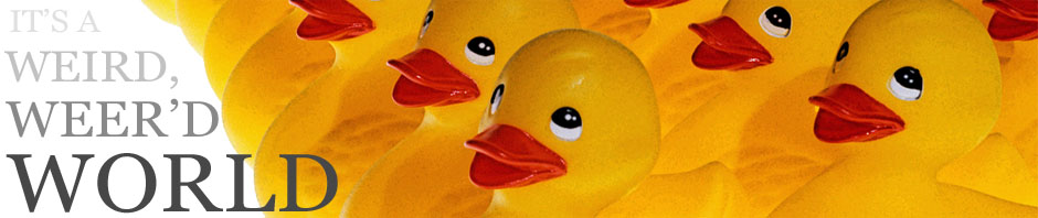
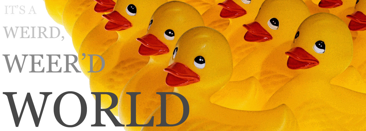
About a Month ago reader a fellow blogger Bluesun made up a really neat header for the blog. I hadn’t said anything but I do want a header that includes ducks in it not only because of my “You are not a Duck” line for shoulder carry, but because I generally feel Ducks rule…and I’m a biologist so animals are a neat theme. Also I like rubber ducks because they’re ducks, and nothing says “I’m here to have fun” like rubber ducks. The image is a little cropped form his full image, since I have ZERO graphics fu, I’m asking to see if he can format it a little closer.
**UPDATE** Just got an updated image. I think this will be how the blog will look for the time being.
Thanks again Bluesun! So how does it look to you?

This looks great– the others that I just sent you may get the “It’s a weird,” in it too, if you want it.
Pretty good! I’m trying not to be OCD and looking for all the artistic flaws.
Those ducks are missing their tape.
It is very… yellow.
I’ll have to keep my eyes close when I read your blog.
Ummmm…
Ducks?
Rubber ducks?
Errr……
Yellow covers it…
Weird….
If it looks like a duck and quacks like a duck…
It’s a totally awesome new header. =)
Very nice. Sometimes a duck is just a duck, to paraphrase Freud
Looks good!
Quack!
What did you do to those poor, poor ducks? They look like they’re on drugs.
They would only take payment in Quack Cocaine ….*rimshot*
I think there should ba a corkscrew in there too. For grins.
😀
http://www.youtube.com/watch?v=bybYCwjkm_s
HOG!!! 😉